3. Maps
Ready-made maps in one line: static maps for papers and interactive maps to explore.
Maps need three packages, installed once:
install.packages(c("sf", "ggplot2", "leaflet"))Static map
library(localdatasus)

circ <- obitos_bairro("Rio de Janeiro", 2023, cid = "I")
mapa_bairro(circ, titulo = "Deaths from circulatory diseases, Rio de Janeiro, 2023")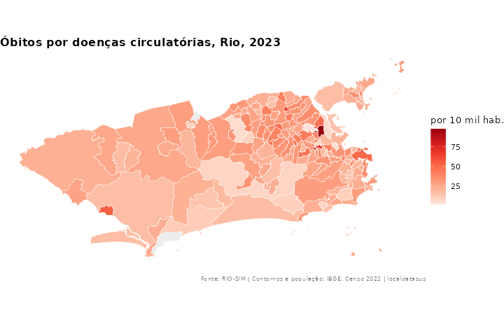
- Color: by default, the map is colored by the rate per 10,000 inhabitants.
- Boundaries: official IBGE neighborhood boundaries (2022 Census), downloaded once per state.
- Grey: neighborhoods without data.
Choose what to color and the palette
mapa_bairro(circ, valor = "obitos")             # color by the count ("valor" = value)
mapa_bairro(circ, cores = "Blues")              # other palettes: "YlOrRd", "Greens", "Purples"...
Automatic panels
If the table has a por breakdown (or several years), the map is split into panels:
por_sexo <- obitos_bairro("Rio de Janeiro", 2023, cid = "I", por = "sexo")
mapa_bairro(subset(por_sexo, sexo != "Ignorado"))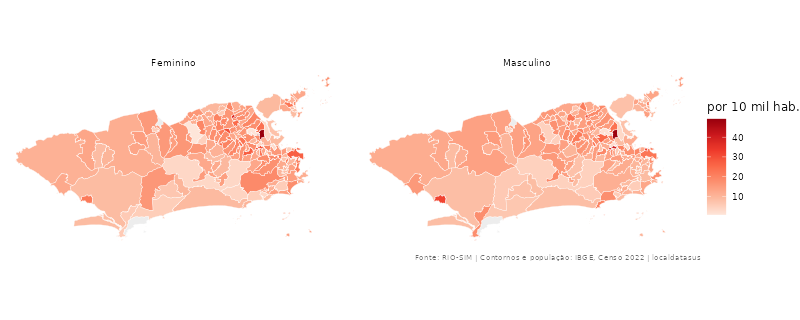
Other places
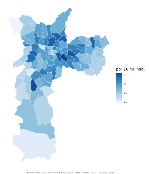
mapa_bairro(obitos_bairro("São Paulo", 2023), cores = "Blues")
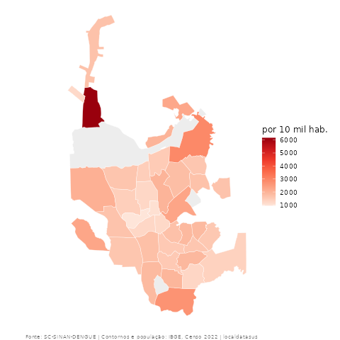
mapa_bairro(agravos_bairro("dengue", "Joinville", 2024))
Customize and save
mapa_bairro() returns a regular ggplot2 plot:
library(ggplot2)
mapa <- mapa_bairro(circ) + labs(subtitle = "Source: Rio de Janeiro City Health Department")
ggsave("map.png", mapa, width = 8, height = 5, dpi = 300)
Interactive map
mapa_interativo(agravos_bairro("dengue", "Rio de Janeiro", 2024))The map opens in RStudio’s Viewer, over a street basemap. Hover over a neighborhood to see its name, or click it to see cases, rate and population. To save it as a web page:
m <- mapa_interativo(circ)
htmlwidgets::saveWidget(m, "map.html")
In QGIS
Every table has lat and lon. In QGIS, use Layer → Add Layer → Delimited Text, with X = lon and Y = lat. For polygons, join on codigo_ibge with the IBGE neighborhood boundaries.